


Sellpy is a service that the users to send their used items in a bag to sell or donate, but it was facing unhappy customers whose expectations do not match their expectations.
As a result, Sellpy implemented many features from our findings and UX improvements.
Long read ahead, 6 weeks UX research step by step.
6 weeks UX research. The team of 7 started the project from sorting the issues by priorities. We spotted that the service has problems layered at a different stage of the customer journey. We boiled down our tackle points by quadrant graph analysis by the score of "impact" and "easier to implement" to fit into 6 weeks project time flame. From this, we committed to tackling the touchpoint with the customers.
Swedish team members conducted a telephone interview with previous customers. We recruited them from the customer list and the social network.
We also tried to experience the actual service as a customer from ordering a bag from a website, packing a bag, ordering a car to pick up a bag, and selling the clothes.
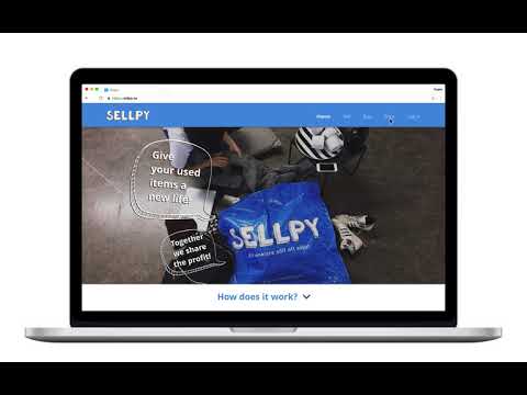
Our hypothesis from the desktop research and meetings in the team was that the current website, which is an initial and primary touchpoint for the customers, actually made them confused. By conducting a user interface test planned by me, the majority of users were not able to reach the needed information to understand the service flow. Due to the complicated and unfriendly website informational structure, the initial touchpoint did not work as an on-boarding process, and as a result, the customers were unclear what to expect from the service when they order a bag.
From the mapping, we found that central dissatisfaction moments were happening at the point of assorting items, and when the items are sold. Till then, the customers were quite happy to expect the initial website experience.
From all research, the customer frustrations were generated from
1. Expected revenue VS Actual revenue
Due to the lack of information about price reference at the on-boarding stage, the customers are frustrated to find out how little money they make.
2. Unsold items were donated without customer’s approval
Due to lack of enough notifications after sending the items and unclear on-boarding, the customers feel like they were not informed.
Both of them were written on the website, but the customers were not able to reach the information or not understanding them correctly due to the unclear informational structure.
Both of them were written in the website but the customers were not able to reach to the information or not really understanding them correctly due to unclear informational structure.
The reason for dissatisfaction comes from the lacked information at the needed stage for the customers to understand the overall service system. The website was the initial point of contact, but the current website does not function to provide relevant information such as service flow, a price system, the example of price, brand lists, and tracking system.
Thus other 2 UX architects and I designed new site wire flame to follow the ideal information flow that we believe that users need for the smoother on-boarding process to start using the service. Through the process, we especially prioritized to improve price system and tracking service, which were the direct source of the most common frustrations points from the customers.
With new web structure and interface designs, the team prototyped a new website and web feature. We re-organized website structure by adding and eliminating the information, edit page contents, and re-designed interface.
We went back to the test users we had done the first user test with and asked them to compare how they feel about the new version. Also, we conducted user interface test with completely new test users to ask how much they can understand about the service for the first glance.
Verification showed improvements. The new version gave more information and fewer confusions for all the users.
To present a whole process and deliverables, we wanted to try more immersive presentation experience for the client. Thus we decorated an entire small room to Sellpy room. By putting up all documents in order of our project flow, Research, Analysis, Prototype, and Verification to express full creative journey. We invited the clients into the room and explained, step by step.
The client's first word was, "It was much more than we expected." After taking the deliverables to the internal team, the client website was changed into a more user-friendly structure.